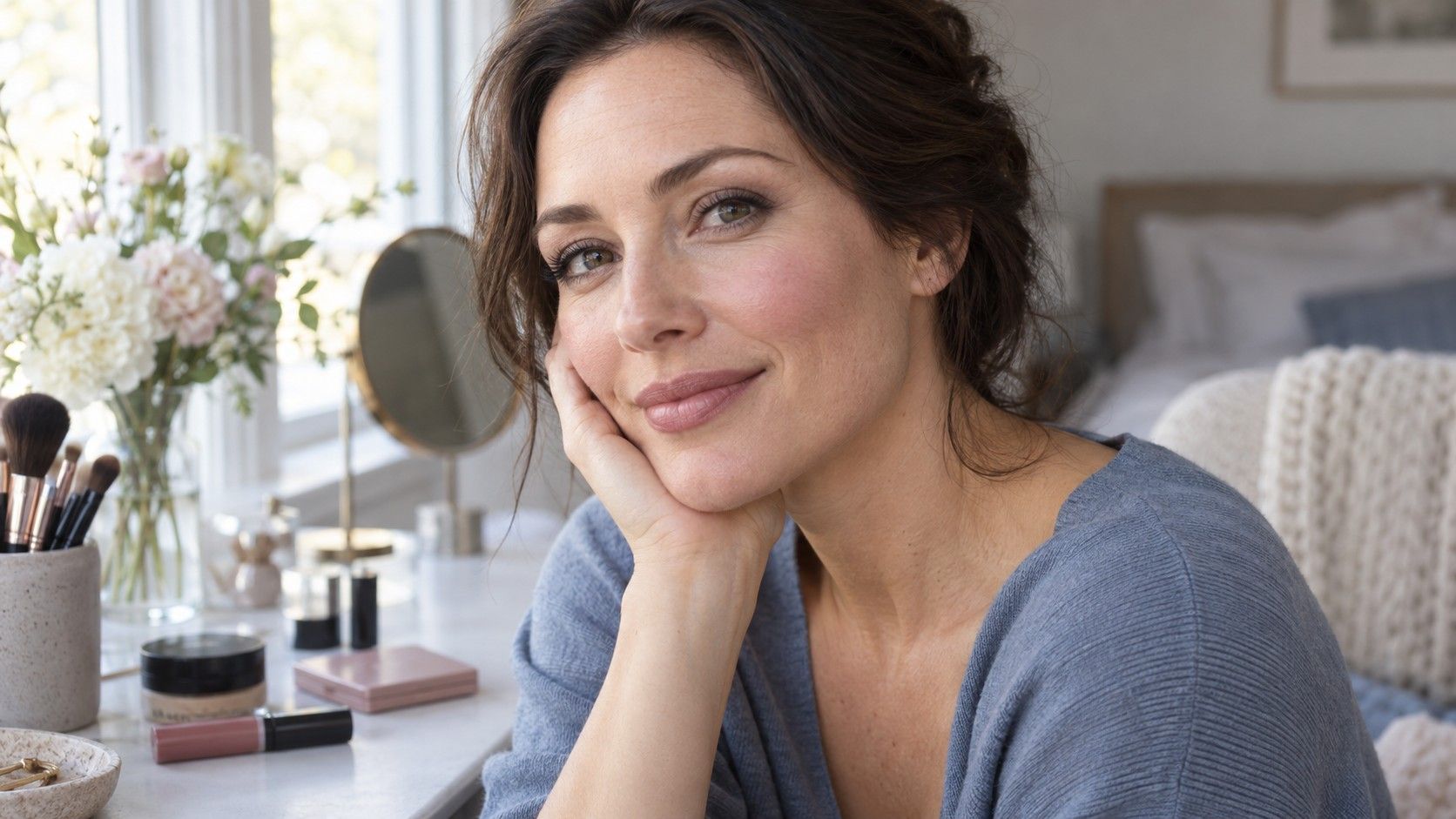
A summer makeup palette usually points toward cooler, softer colors, but a lipstick called rose can look pink, brown or nearly purple once applied. The label is a starting point for comparing products, not a promise about your face. Begin with the makeup you already own and test one change at a time. A muted lip, a gentle blush and softer eye definition can work together beautifully, yet their depth and finish matter as much as the color family printed on the box.
Start in daylight with a familiar base
Set up beside a window in indirect daylight, away from a bright colored wall or curtain. Turn off a strongly yellow lamp. Use the base products you normally wear, or leave your skin bare if that is your usual routine. Changing foundation, blush and lipstick together makes it difficult to tell which change you prefer. Check the result in the mirror at a normal conversational distance before zooming in on a phone photograph.
In seasonal color analysis, Summer commonly describes a cooler palette with some softness, although subcategories and their boundaries vary between systems. Light Summer, Cool Summer and Soft Summer suggestions can therefore differ. Do not assume every Summer product should be very pale or equally gray. A deeper rose may be more useful than a pastel pink, and a slightly clearer cheek color may work better than a dusty powder. Keep the comparison tied to your actual face and intended look.
Foundation is a separate matching task. Choose its depth and undertone by comparing the product with your skin and the area around your jaw and neck, following its instructions. A season name is not a foundation shade. The same applies to concealer: an appealing palette does not tell you which formula or coverage you need. Establish a base you find comfortable, then assess the colored products over it.
Compare lip colors with the same amount of coverage
A sheer berry balm and an opaque coral lipstick make an uneven temperature test. Your natural lip color shows through one and is mostly covered by the other. Compare two products with a similar finish and opacity, or apply them as similarly as their formulas allow. Begin with a rose and a mauve at roughly the same depth. Then compare the preferred one with a slightly warmer version to see whether the cooler direction is helping.
Use your usual application rather than an exaggerated swatch. A single thin coat may give a muted rose the right balance, while several coats make it much darker. Check the edges: a strongly contrasting liner can turn a gentle lipstick into a more defined look. For a fair comparison, keep the liner constant or leave it out. Remove the first lip color fully and let any temporary rubbing redness settle before judging the next.
Watch for the difference between a soft color and a color that is simply too pale for your preferred effect. If a light mauve seems chalky, try a deeper mauve before rejecting the entire family. If a grayish rose makes the look dull, a somewhat clearer rose may be easier. “Nude” is especially vague. It describes a relationship with the wearer rather than one universal beige, so a nude lipstick that suits someone else may appear very light or warm on you.
| What you notice | Try next | Keep constant |
|---|---|---|
| Pale pink seems chalky | A deeper rose with similar coolness | Opacity and finish |
| Mauve feels too gray | A clearer rose at similar depth | Application thickness |
| Berry dominates the face | A thinner layer or a lighter berry | Eye makeup and clothing |
| Warm nude looks orange | A more neutral rose-brown | Lighting and lip liner |
Judge blush on the cheek rather than in the pan
Rose, pink and mauve blushes are useful candidates, but the pan shows a concentrated product. A sheer cream blends with the color beneath it, while an opaque powder may cover more of that color. Shimmer can make a shade look lighter when it catches the window. Apply a small amount with the tool you normally use, blend it, and look at the entire face. Build gradually instead of comparing a heavy stripe with a finished application.
Start with a soft rose at a depth you can actually see once blended. If it disappears, try building a little or comparing a deeper version. If it looks too strong, reduce the amount before changing the color family. For mauve, watch whether the particular product leans brown, purple or gray after blending. Product names do not settle that question. A color that seems almost neutral on a white tester card can read differently on the cheek.
Keep lip and cheek colors related without insisting on an exact match. A muted rose lip with a gentle pink cheek often gives a quieter result than a strong warm cheek beside a cool mauve lip. That contrast may still be a deliberate style choice. Compare both versions with the same top and decide whether you want harmony or a more noticeable contrast. Testers should be used according to the retailer's hygiene arrangements; never share eye or lip products casually to complete a palette experiment.
Adjust eye definition before replacing black
Black liner and mascara are sometimes described as unsuitable for Summer palettes. That is too broad to be a useful instruction. The thickness, placement and surrounding makeup change the result. A thin line close to the lashes differs from a broad black wing, and one coat of mascara differs from several. Try a smaller amount first. You may keep the product while getting the gentler definition you wanted.
For an alternative, compare charcoal, soft navy or a neutral-to-cool brown. Brown is not automatically soft or cool: some formulas lean orange or reddish. A gray-brown pencil can give a different effect from a warm bronze. Smudge the edge if that suits your routine, then look from a few steps away. The goal might be visible definition without making the liner the strongest feature. For an evening look, that stronger feature may be exactly right.
On the lids, test taupe, muted rose-brown or a soft plum in a wearable application. A reflective silver and a matte gray cannot be assessed on hue alone because their finishes behave differently. Keep dramatic shimmer for a separate comparison. Eye color can inspire a combination, but it does not dictate the correct palette. Choose products intended for the eye area and follow their use instructions; seasonal labels say nothing about formula suitability.
Check the whole face beside the clothes you wear
Put on a familiar top before making the final decision. A rose lipstick can feel coherent beside a blue-gray knit and much cooler beside a strong orange shirt. Neither observation proves a different season. The colors are interacting in the outfit. Compare a neutral top, then the garment you plan to wear that day. If you need to change three other products to make one lipstick feel comfortable, it may be less convenient than a slightly different shade.
Take the look through the conditions where you will use it. Daylight helps with the comparison, but an office, restaurant or evening event has its own lighting. Check how much contrast you want in those settings. Avoid judging only through a phone's beauty filter or auto-adjusted image. A quick photograph can record the combination, while the mirror and an ordinary viewing distance remain useful checks on the effect you actually see.
For a small working selection, keep one everyday lip color, one blush and one eye-definition option that cooperate with several tops. Add a deeper lip or more defined eye only if you want that variation. Write the exact product, shade and application alongside an outfit photo. You may discover that a sheer berry is easier than an opaque mauve, or that charcoal liner is useful while black mascara stays. Those are practical results, even if an online Summer chart suggests otherwise.
Before buying a full summer makeup palette, finish several complete looks with what you have. Replace a product because a specific alternative works better, not because its packaging lacks a seasonal label. The most useful palette supports the amount of time, color and definition you enjoy wearing. Rose and mauve are good places to begin testing; the finished face gets the final say.