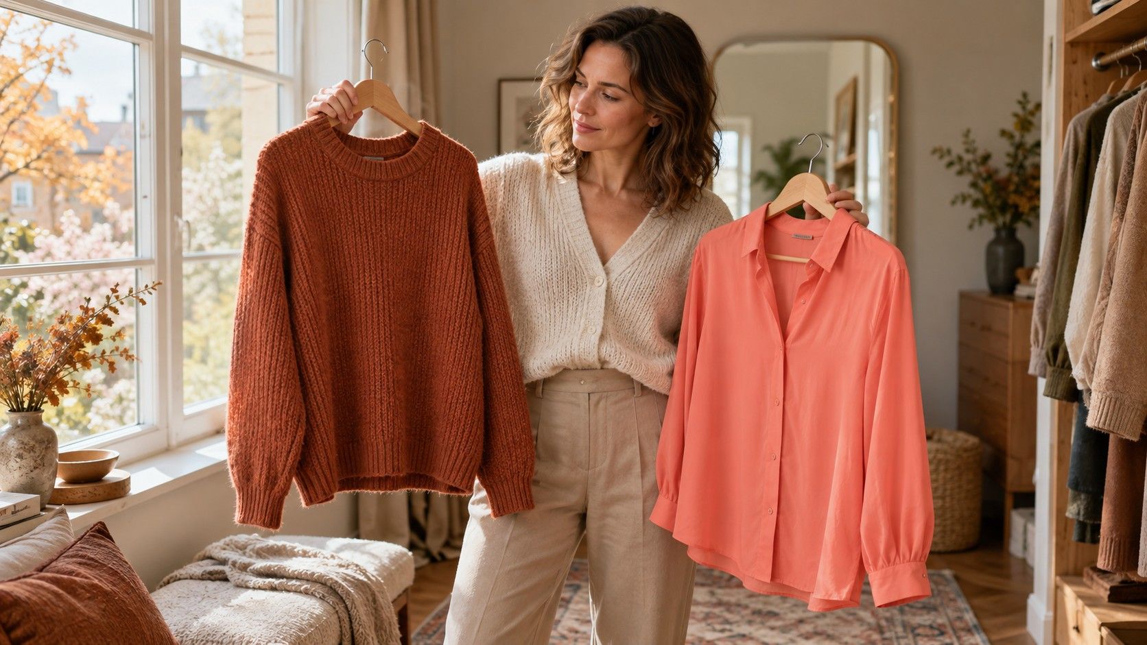
A terracotta sweater and a coral shirt can both look warm on a hanger, yet behave very differently beside a face. That is the useful starting point for Autumn versus Spring: warmth may be shared, while clarity, depth and the amount of muted color vary. A season label alone cannot settle which shirt belongs in your wardrobe. A few controlled fabric comparisons can reveal whether earthy warmth, clear warmth or a mixture gives you more usable choices. Treat the result as a working wardrobe direction, with room for exceptions.
Check warmth before deciding which warm season fits
In many seasonal color systems, Autumn and Spring are warm families. Autumn generally emphasizes earthy or muted warmth; Spring generally emphasizes clearer, livelier warmth. Their subgroups complicate that tidy division. A deeper Spring shade can overlap visually with a lighter Autumn shade, and different palette publishers draw different boundaries. Compare actual swatches before comparing names.
Start beside a window in indirect daylight. Switch off a warm bedside lamp, remove strongly colored lipstick, and cover a bright top with a neutral cloth. Hold fabric across the chest so enough color reaches the area below the chin. A narrow bracelet or tiny paint chip is difficult to judge. Use a plain background and keep your position fixed while exchanging fabrics.
First try several temperature comparisons at similar depth: peach against cool pink, warm camel against a cooler taupe, and tomato red against a blue leaning red. Look for a repeated preference rather than a single dramatic reveal. Does the face remain easy to see, or does one fabric seem to dominate? Are shadows simply changing with your angle? These are visual observations, not measurements of health or proof of a fixed biological category.
If neither warm family consistently helps, leave Autumn versus Spring unresolved. A comparison can fail because the fabrics differ too much in brightness or because you are testing the wrong starting families. There is little benefit in forcing a warm answer just because your hair looks golden in sunlight.
Put terracotta beside clear coral without changing everything else
Terracotta versus clear coral is a useful first pair because both can carry visible orange warmth. Choose a medium terracotta with an earthy, softened appearance and a medium coral that looks cleaner and brighter. Avoid a very dark rust against a nearly pastel coral: that comparison changes depth so much that it tells you little about softness.
Bring each fabric to the same height, then exchange it a few times. Allow your eyes a short pause between colors. Notice whether the clear coral brings attention back to your features or whether the color appears to arrive before you do. With terracotta, check whether its muted surface looks cohesive or makes the whole combination seem dull. A quieter impression is not automatically better; a brighter impression is not automatically more flattering.
Repeat with a second pair, such as warm olive versus fresh yellow green, while keeping both reasonably close in depth. Retail names are unreliable here. A shirt called sage may be cool gray green, warm olive or something between them. Judge the cloth in front of you, and record a plain description such as “medium muted yellow green” rather than trusting the product name.
Spring color analysis becomes more useful when several clear warm fabrics work together. Autumn becomes a stronger direction when multiple softened warm fabrics are consistently easier to wear. One excellent coral scarf is still just one excellent scarf. It may be a crossover shade, a personal preference, or a successful accent rather than a complete palette answer.
Use cream, brown and golden neutrals to check everyday wear
Neutrals are where the comparison meets ordinary clothes. Put a warm cream top with a light golden tan cardigan, then try a similar cream with a softer camel or medium earthy brown. Keep the top visible in roughly the same amount. If the brown version feels too heavy, test a lighter brown before rejecting Autumn; you may be reacting to depth rather than muted warmth.
A Spring leaning neutral set often feels clearer or lighter: warm ivory, golden beige and a clean medium brown. An Autumn leaning set often tolerates more earthy complexity: oatmeal, camel, warm olive and chocolate. These are shopping directions, not exclusive lists. A particular oatmeal can be so gray that it behaves differently from the warm version imagined on a palette chart.
| Practical comparison | What to keep similar | What to observe |
|---|---|---|
| Terracotta and clear coral | Medium depth, warm hue, fabric area | Whether softness or clearer color works more easily |
| Muted olive and fresh yellow green | Depth and visible warmth | Whether an earthy or cleaner green dominates less |
| Soft camel and golden tan | Lightness, neckline and texture | Which neutral supports a plain cream top |
| Earthy brown and clean warm brown | Depth and outfit contrast | Whether the difference survives a full outfit |
Check these combinations with trousers and shoes you already own. A neutral that looks convincing in a mirror but clashes with every jacket is not an urgent purchase. Color analysis should reduce difficult combinations. Keep a successful brown in service even if its label seems to belong to the neighboring season.
Separate print contrast and surface finish from the color itself
A crisp floral shirt and a brushed wool sweater make a poor direct test. The shirt may contain bright cream gaps, while the sweater absorbs light and softens every edge. You could prefer one because of its texture, pattern scale or neckline. Begin with plain fabrics in similar finishes, then use prints to see how the result translates.
For a Spring direction, compare a print with clear warm colors and distinct edges against one whose colors blend into an earthy background. For an Autumn direction, check whether the blended version remains expressive enough, rather than assuming a muted print must be best. Large black outlines add contrast to either example and can overwhelm the color question. Try to find prints without that extra variable.
Shine deserves its own check. A warm satin blouse can look much brighter where it catches the window than a matte cotton blouse in the same general hue. Turn slightly and observe both the lit area and the shaded area. If only the reflective version causes trouble, a matte version may solve it without changing the color family.
The same caution applies to jewelry. Gold finishes range from pale and polished to dark and antique. Liking brushed antique gold does not establish Autumn, and liking shiny yellow gold does not establish Spring. Use accessories to refine an outfit after fabric comparisons, rather than asking one ring to determine the whole palette.
Build a small comparison capsule before buying a palette
Choose two existing neutrals and three accent colors that represent your best comparisons. An earthy version might contain cream, camel, terracotta, warm olive and a softened teal. A clearer version might use ivory, golden tan, coral, fresh green and a clearer warm turquoise. Keep the overall depth suitable for the clothes you actually wear; neither family requires every outfit to be light or every outfit to be dark.
Make three combinations from each group and wear them in similar daylight. A five minute mirror session can be distorted by novelty, while a familiar outfit lets you notice whether you keep adjusting lipstick or adding a scarf to make the color comfortable. Write down the exact garment and the useful observation. “Coral cotton shirt works with ivory cardigan” is more actionable than “definitely Spring.”
Photographs can help you remember combinations, but phone processing often changes exposure, warmth and saturation between frames. Keep lighting and camera settings as stable as possible, and use the mirror as a second reference. Do not compare one sunny photograph with another taken under a yellow kitchen light. A changed photograph can create a false result with impressive confidence.
After a week of comparisons, retain the colors that repeatedly earn a place. If your strongest set combines softer greens with clear coral, that is still a useful outcome. You can investigate subgroups later, using the same publisher's definitions so the labels remain comparable. For now, a small set of warm clothes that cooperate is enough evidence to guide the next purchase.