A pale peach shirt and a dusty pink shirt can look almost interchangeable on a hanger. Under the chin, they may tell a different story. The spring vs summer color palette question becomes easier when you compare garments that differ in one useful way, rather than judging a whole rainbow at once. In common seasonal systems, Spring leans warm and relatively clear; Summer leans cool and relatively soft. Those are organizing ideas for clothes, not a diagnosis of a face. A repeatable comparison can help you choose a sweater even while your season remains uncertain.
Hold lightness steady before testing temperature
Start beside a window in indirect daylight, with a plain background and enough space to hold fabric from shoulder to shoulder. Switch off a yellow bedside lamp and avoid a patch of direct sun across one cheek. You are trying to keep the viewing conditions steady. A mirror is useful because a phone may alter exposure and white balance whenever a new color fills the frame. If you take pictures, lock those settings where possible and keep the camera in the same position.
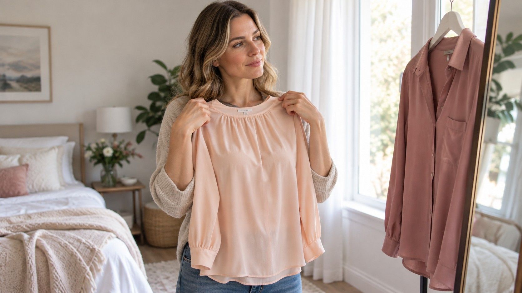
Choose two fabrics of similar lightness, sometimes called value. A light peach against a deep plum changes temperature, depth and intensity together, so the result cannot tell you which difference mattered. Light peach and light cool rose make a more manageable first pair. Both should be plain, roughly the same size and similar in finish. A glossy satin scarf reflects light differently from a brushed cotton T-shirt, even when their colors appear close.
Look at the whole face before concentrating on a feature. Does one fabric seem to draw attention away from your expression? Are the shadows around the mouth more noticeable? Does the color appear separate from the person wearing it? These are visual judgments, and different observers may disagree. Write a short description such as “rose feels calmer; peach looks lively but slightly separate.” That is more useful later than a confident tick in a Spring box.
Repeat on another day before buying anything. A tan, tinted moisturizer, reflected color from a nearby wall or simple fatigue can change your impression. Remove strongly colored lipstick for an initial comparison if you are comfortable doing so, then test your usual makeup later. The first session asks about the fabrics; the second asks whether they work in your actual routine.
Compare peach with rose near the face
Place peach beneath the chin, look away briefly, then replace it with rose. Give each the same amount of time. Rapidly switching back and forth can make the most dramatic change seem like the best result, while staring too long makes almost any color start to feel familiar. Keep your head level, and avoid leaning closer for the fabric you already prefer.
Warm peach usually brings a yellow or orange direction to a pink; a cool rose moves toward a blue-based pink. Names on shopping pages are unreliable. One brand's rose may be coral, and “nude” says very little about temperature. Put the two items beside each other before the face test. If you cannot see a meaningful difference between them, find a clearer pair instead of forcing a conclusion.
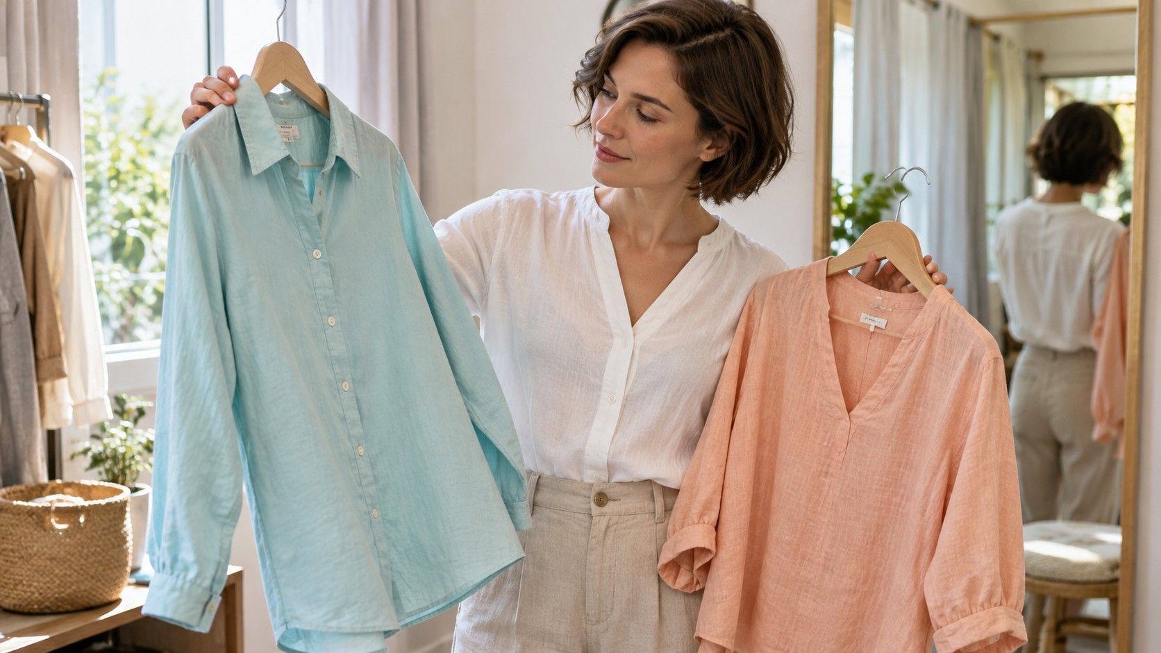
A second comparison helps check whether the pink result travels to another color family. Try a light warm aqua against a similarly light blue-gray, while recognizing that this pair also changes softness. Or compare a warm pale green with a cooler pale green of similar saturation. Household garments rarely provide laboratory precision. Label the limitation in your notes, rather than treating every favorable color as evidence for the same season.
Do not use redness, freckles or visible veins as a shortcut to a palette. Surface color can distract from the comparison, and there is no need to assign every feature a warm or cool label. Similarly, a good-looking gold necklace does not settle the issue: its size, shine and distance from the face matter. The question here is narrower: which of two comparable fabric colors gives the effect you want?
Separate clear color from soft color
Temperature is only part of the difference. Chroma describes how vivid or muted a color appears. A clear coral and a muted salmon may both lean warm, but they behave differently in an outfit. Spring palettes are commonly presented with more clarity; Summer palettes usually contain more softened color. Specific twelve-season systems divide these ranges further, so a Light Spring comparison will not look identical to a Bright Spring comparison.
Test clarity with two colors that stay reasonably close in hue and value. Put a clean light pink beside a grayed light pink, or a clear medium blue beside a softened blue of similar depth. If the softer option looks comfortable but the clearer one dominates, that supports a preference for lower intensity in that particular family. It does not automatically prove Summer, especially if your earlier comparisons favored warmth.
| Comparison | Keep similar | What to observe |
|---|---|---|
| Peach and cool rose | Lightness, fabric finish, size | Whether warmth or coolness feels easier near the face |
| Clear pink and dusty pink | Hue direction and depth | Whether stronger color feels balanced or distracting |
| Warm ivory and cool soft white | Opacity and lighting | Whether a small temperature shift changes a useful neutral |
| Two complete outfits | Silhouette and amount of color | Whether the preference survives ordinary styling |
There is room between crisp and heavily muted. A color can be moderately soft without looking gray, just as a Spring color can be gentle without being fluorescent. Avoid comparing an electric party top with a faded old T-shirt and calling the difference seasonal. Wear, detergent and fabric texture have already changed that experiment. If neither looks convincing, a middle-intensity version may be your most useful purchase.
Test two everyday outfits
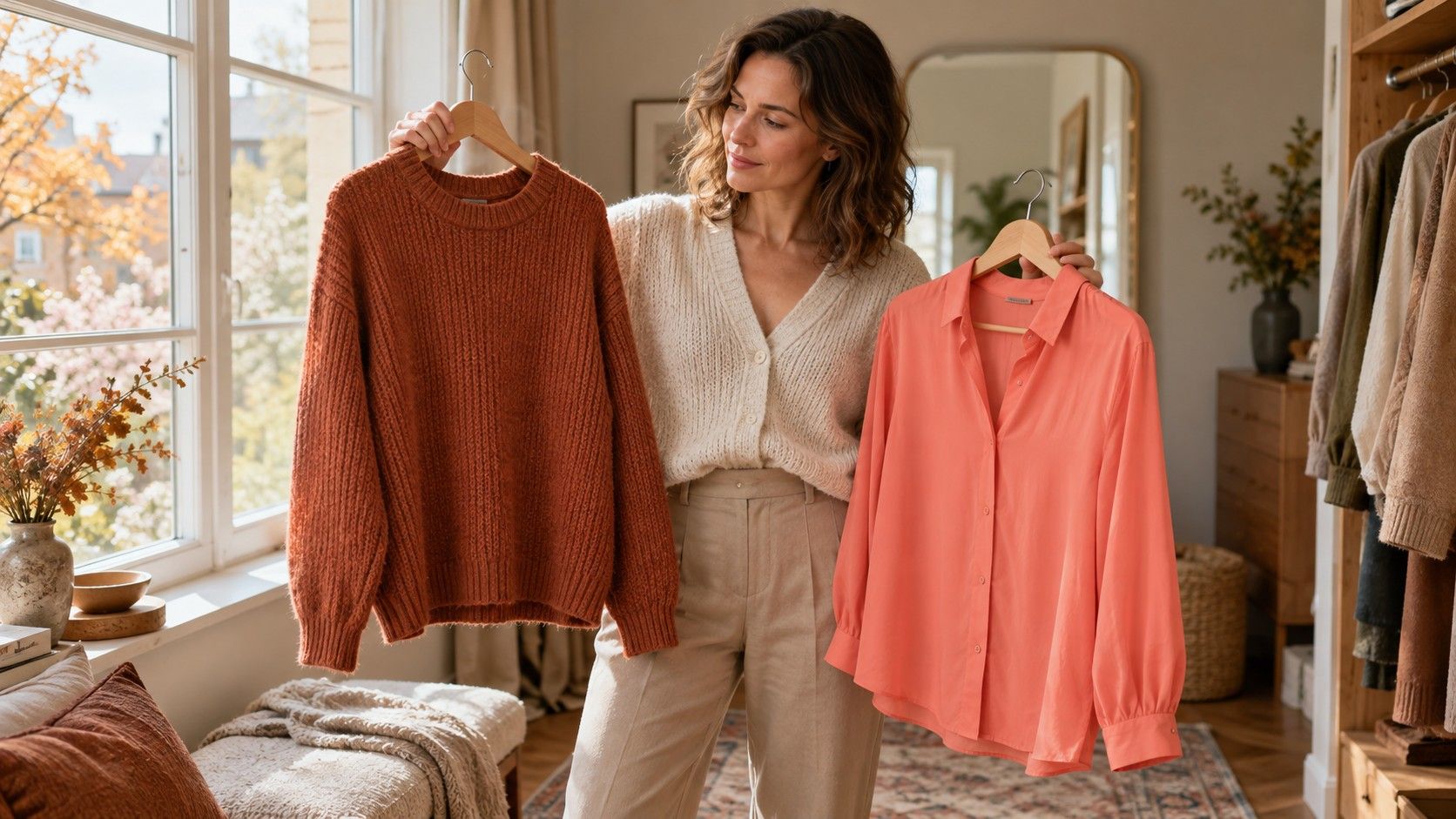
Build one outfit around a warm light top, a warm neutral and a small clear accent. Peach with warm beige trousers and a light aqua scarf is one possible starting point. For the cooler, softer comparison, try dusty rose, a cool taupe or gray neutral, and a softened blue accent. These are examples of palette directions, not uniforms. Keep the garments similar in shape so a favorite neckline does not decide the result.
Check each outfit at a normal viewing distance, then sit down and see what remains visible above a desk or table. A trouser color can work well without belonging near your face. Conversely, a strong scarf may dominate a soft shirt because it occupies the highest-contrast area. Moving a difficult color to a bag, shoes or a narrow stripe is a practical styling choice, and it preserves clothing you enjoy.
Consider the rest of your wardrobe before making the winning top a new shopping rule. If the peach only works with trousers you dislike, it may have limited value. A dusty blue shirt that goes with three existing jackets can be the better choice even if another drape looks marginally more flattering. Seasonal color analysis earns its place when it reduces wasted purchases and makes combinations easier to repeat.
Bring familiar makeup and eyewear back into the comparison. A coral lip can connect with a warm outfit; a soft rose lip may connect with a cooler one. That coordination can change your preference without changing an underlying season. Test what you actually wear on a workday. Keep a photo or written outfit recipe for the result you like, including the neutral and accessory, so you can recreate the whole effect.
Keep a provisional result when tests disagree
Mixed results are useful information. You might prefer warm pinks but softened greens, or find that both light palettes work while medium-depth colors overwhelm the outfit. Record each pattern separately: temperature, lightness and intensity. A statement such as “light, moderately clear colors seem easiest; temperature remains uncertain” can guide shopping more accurately than forcing a season name after one afternoon.
Repeat the most informative pair under comparable daylight, using a different garment if possible. If a preference disappears when satin becomes cotton, finish may have contributed. If it changes only in a photograph, look at the mirror result and camera settings before revising your wardrobe. A friend can help by swapping fabrics without announcing the label, although agreement is still an opinion rather than objective proof.
For a next purchase, choose a low-risk item in a color that performed consistently: a T-shirt, scarf or returnable knit. Wear it with at least two existing outfits and assess comfort as well as appearance. Leave expensive coats and major hair changes until you have stronger evidence about what you enjoy. The useful outcome is a small set of dependable colors, with enough flexibility for taste, lighting and the clothes you already own.