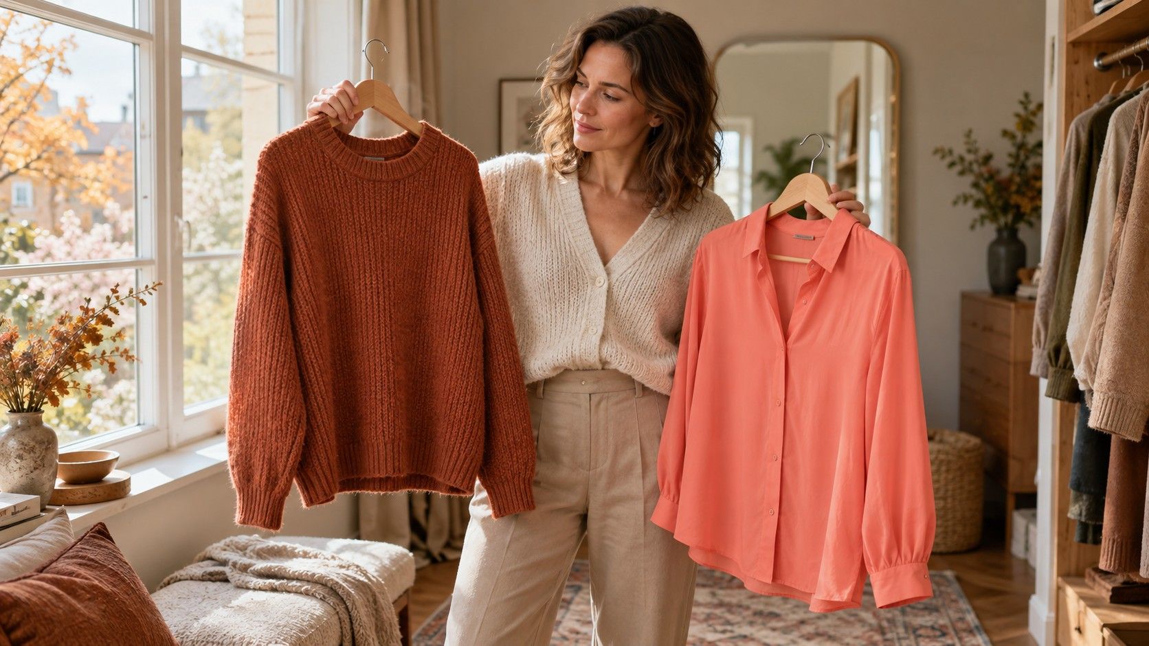
Lists of soft summer colors to avoid often begin with black, white, orange and anything bright. That can make a perfectly useful wardrobe seem suddenly wrong. Soft Summer generally points toward cooler, muted colors in systems that use the label, but it does not create a universal ban on particular garments. Before replacing a black coat or bright shirt, test how its depth, intensity, location and neighboring colors affect the outfit. Small changes can be more useful than a new shopping list.
Test the garment before banning the color
Start with one item that has become difficult to wear: perhaps a vivid orange blouse or a black crewneck. Try it beside a familiar alternative in indirect daylight, using the same background and makeup. Look from a normal distance rather than examining a magnified selfie. A season label is a framework for comparison, and definitions vary between color analysis providers. It cannot tell you everything about the cut, fabric, finish or personal meaning of a garment.
Describe what seems difficult. Is the color very bright, very dark, warmer than you prefer, or part of a stark contrast? Hue describes the color family and its warmer or cooler direction; value describes lightness and darkness; chroma describes intensity. A deep bright orange changes all three compared with a pale gray-blue. To understand your preference, compare closer pairs: two similar-depth greens with different saturation, or a cool and warmer pink at similar lightness.
A useful test leaves room for intention. You may like a strong jacket precisely because it stands out. The question is whether the result matches the look you want and feels practical to wear. Avoid assigning failure to your skin, age or features. Record the outfit effect instead: “the bright neckline dominates” or “the dark jacket works when the shirt is lighter.” This gives you a clear adjustment to try.
Move strong color away from your face
A saturated cobalt sweater and cobalt shoes occupy very different parts of an outfit. If the sweater feels demanding, the shoes can provide the color in a smaller area. Bright trousers, a bag or a belt may also be easier to combine with a muted top. This is a styling option, not a rule that everyone needs to follow. Start with garments you own and check the proportions in a full-length mirror.
An open neckline can reduce the solid block of color immediately beneath the face. A layer provides another possibility: wear the bright shirt open over a softer top, or place a muted scarf inside the neckline of a strong coat. Compare the garment alone and with the layer in the same light. If the added item feels fussy or impractical, it is not a useful solution for your routine, even if the colors look pleasing.
| Existing garment | First adjustment to test | What to compare |
|---|---|---|
| Bright warm shirt | Wear open over a muted neutral top | Amount of strong color near the face |
| Black coat | Add a soft blue-gray or rose scarf | Solid black neckline versus a lighter border |
| Optic-white blouse | Layer beneath a muted jacket | Large white area versus a smaller visible section |
| Vivid trousers | Pair with a quiet top and simple accessories | Overall balance and preferred emphasis |
| Orange accessory | Use as one small accent | A single accent versus repeated orange details |
Keep practical constraints visible. A uniform, protective coat or favorite walking shoes may matter far more than a palette suggestion. It is reasonable to adapt the surrounding outfit or simply wear the item as it is. You do not need every object you own to participate in seasonal color analysis.
Soften a black outfit with nearby colors
Black creates a dark anchor, and a black-and-white pairing can create strong contrast. If that contrast feels sharper than you want, keep the black trousers and change the top to a medium blue-gray, muted rose or soft navy. Then try the black jacket open. These changes reduce the size and placement of the darkest area without requiring you to replace useful basics. The exact shade and fabric matter more than the color name alone.
For a black dress, test a soft scarf, a muted cardigan or a slightly less stark accessory near the neckline. A pattern containing black and softer colors can also connect the dress with the added layer. Avoid piling on several corrections at once. Begin with one change so you can tell whether it helped. A necklace may be enough for your preferred effect, or it may make little visible difference; assess the actual outfit.
If you are buying a replacement anyway, compare black with charcoal, soft navy and a deeper gray-brown. Do this with your existing shoes and outerwear, since a new neutral needs to cooperate with the wardrobe around it. Darker does not always mean harsher, and charcoal is not automatically better in every fabric. A matte charcoal knit and a shiny black blouse differ in both finish and depth. Treat the replacement as an individual purchase rather than a guaranteed upgrade.
Separate bright white from cream and warm yellow
White is not one consistent clothing color. An optic-white cotton shirt can look crisp, while a softer white may create a gentler boundary beside gray or blue. Ivory often carries a warmer cast, which may or may not suit the combination you prefer. Compare these fabrics together in daylight. Replacing every white item with cream on the assumption that softer always means warmer can exchange one difficulty for another.
Try the whole outfit before deciding. A small white collar under a muted sweater reads differently from a white turtleneck, jacket and trousers together. A print with a soft-white ground and muted blue detail can create a quieter transition than a large uninterrupted area. If white is required for work, concentrate on the cut, amount visible and colors around it. The garment can remain entirely serviceable.
Yellow also needs a specific description. Clear lemon, muted straw and strong golden yellow differ in warmth, depth and saturation. If one golden shirt seems too intense, compare a less saturated yellow at similar depth rather than rejecting yellow as a family. You may still prefer a different color near your face. A yellow bag or small print detail can preserve the part you enjoy without making it the main element of the outfit.
Handle orange and other warm accents deliberately
Orange often appears on Soft Summer avoidance lists because many versions are warm and saturated. That does not make every rust stripe or peach accessory unusable. Consider the size of the area, its depth and the surrounding palette. A bright orange top is a different proposition from a muted terracotta motif in a blue-gray scarf. There is no need to pretend they have the same effect simply because both contain orange.
If a warm accent feels disconnected, repeat it once in a small detail or choose a pattern that includes both the accent and your main neutral. Compare this with leaving it as a single focal point. Repetition can make the combination feel intentional, but too many repeats may give the accent more prominence than you want. Keep the version you prefer at a normal viewing distance. Styling is allowed to include contrast.
Makeup can change the balance, though it should not become an obligation attached to every garment. Try your normal lip color first. If the outfit only feels usable with a full routine you dislike doing, reserve it for occasions when that routine is welcome or change the layer near your face. A palette is useful when it reduces effort; it becomes less useful when every existing item requires an elaborate rescue.
Keep exceptions and replace clothes at a sensible pace
Set aside three groups after testing: clothes that work easily, clothes that work with a simple adjustment, and clothes you rarely choose even after trying reasonable combinations. These are wardrobe observations, not permanent judgments on colors. Wear the first group, photograph successful combinations from the second and wait before replacing the third. You may find that fit, comfort or maintenance is the real reason an item stays unworn.
For the next purchase, bring a successful garment or a reliable physical swatch if possible. Screen colors and online names are approximate, and shop lighting can obscure subtle differences. Choose an item that works with at least two existing combinations, then check it again at home within the return period. Avoid replacing multiple basics until you know which versions of your chosen neutrals are useful in your actual wardrobe.
The best answer to soft summer colors to avoid is a short, personal record of combinations that need more effort. Keep the black jacket that works, the bright bag you enjoy and any deliberate contrast that fits your style. Use muted, cooler colors as candidates for easier combinations, while allowing the finished outfit to overrule a generic list. That approach preserves useful clothes and makes future choices clearer.