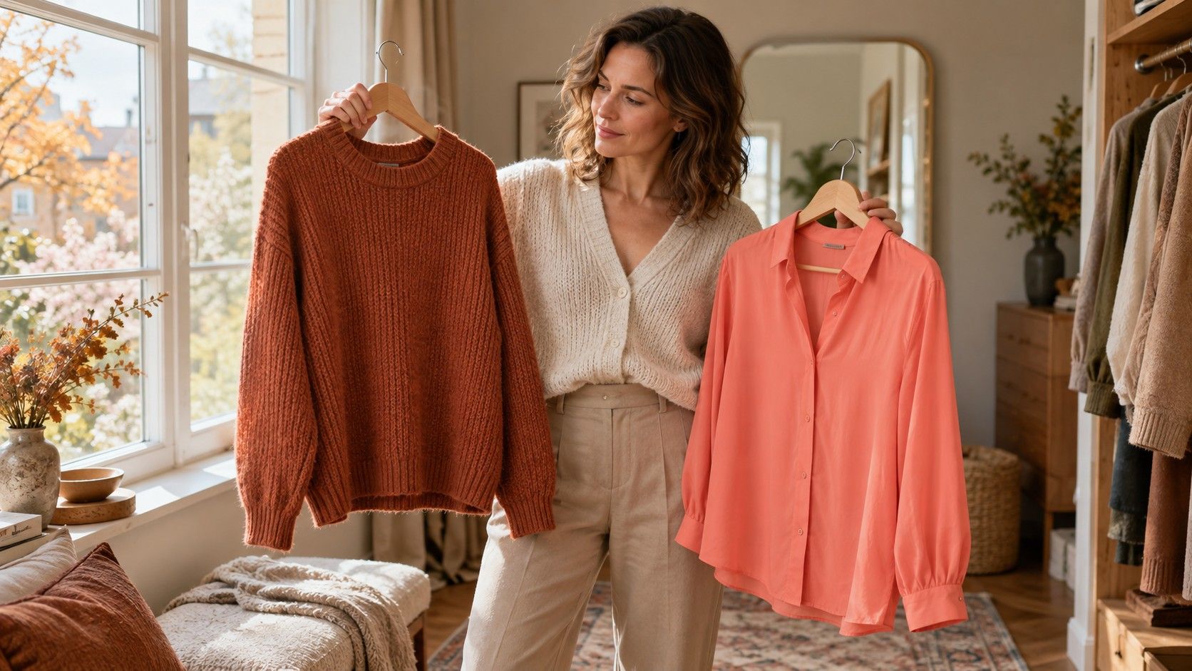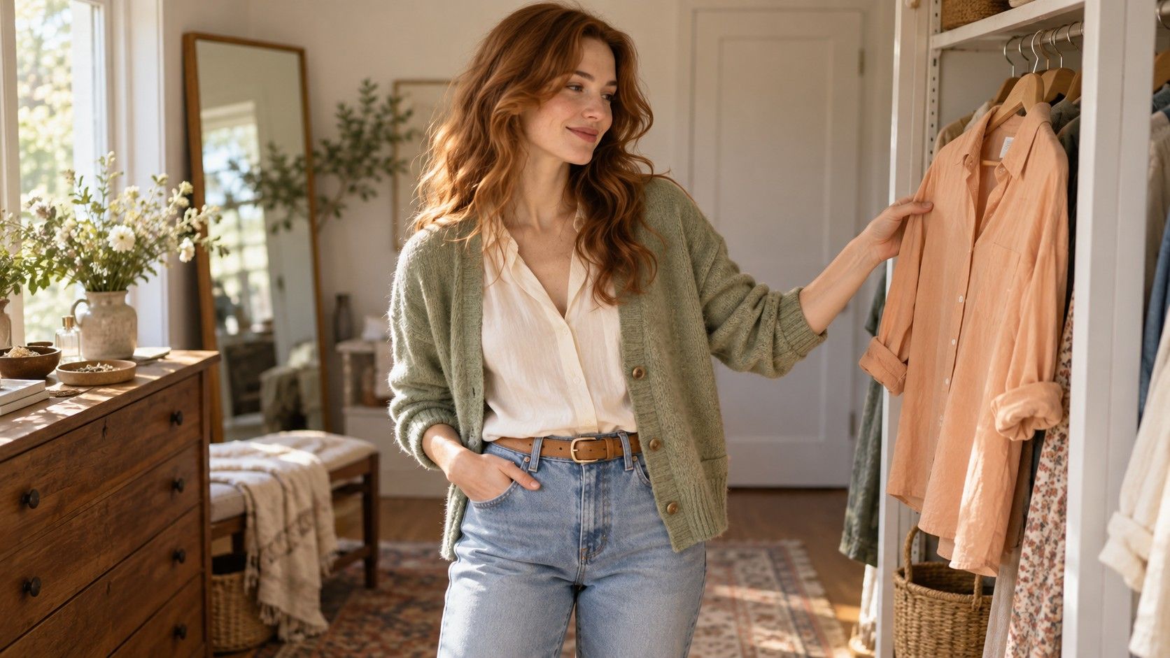
A soft spring color palette can sound like a precise answer until two charts give it different colors. One shows pale peach and warm sage; another includes fairly clear coral and turquoise. The useful question is what the label means in the system that supplied it. Treat its swatches as a proposal to test in clothes. A gentle palette can make getting dressed easier, but a word on an online result cannot tell you whether a dusty cardigan or a clear light shirt will suit the effect you want.
Ask what “soft” means before buying a palette
Soft Spring is not a universal seasonal category. Four-season approaches use Spring, Summer, Autumn and Winter, while expanded approaches divide them in different ways. A provider may use soft to mean less saturated than its other Springs, a Spring leaning toward Autumn, or a proprietary grouping. Those meanings cannot safely be exchanged. Ask for the actual palette, the neighboring categories and a plain explanation of the difference. If all you have is a name, there is too little information to shop accurately.
Three dimensions help unpack the suggestion. Hue describes a color's family and its warmer or cooler direction; value describes how light or dark it appears; chroma describes its intensity or saturation. A pale yellow can still look clear, and a medium green can look muted. Soft and light therefore do different jobs. Keep a screenshot of the original result with the provider's name, then write the proposed qualities beside it. “Light to medium, gently warm, moderately muted” is more useful at a clothing rack than a label whose definition has disappeared.
Be wary of charts that assign the category from eye color, ethnicity or natural hair alone. These features can inspire comparisons, but they do not establish a universally correct palette. The exercise here is visual and preference-based: which fabric combinations create a result you like around your face? It does not require discovering a hidden rule about your identity.
Compare clear and softened fabrics at the same depth
Start near a window in indirect daylight with a plain background. Switch off a strongly yellow lamp and avoid a direct beam of sun across one side of your face. Remove a vivid scarf or tinted glasses that might influence the comparison. Hold two matte fabrics beneath your chin, changing them quickly enough to remember the difference. A shiny satin and a fuzzy knit are difficult partners for this test because reflections and texture change their appearance.
To investigate softness, compare warm coral with a more muted warm rose at a similar depth. Then try clear yellow-green against a softened yellow-green. These are approximate descriptions, not standardized swatches; use the closest fabrics available and note any obvious differences in lightness. If the muted fabric is also much darker, a preference for it cannot be confidently attributed to softness. A small set of controlled pairs beats a pile of unrelated scarves.
| Question | Useful comparison | What can confuse it |
|---|---|---|
| Does lower chroma help? | Clear coral and softened coral at similar depth | Comparing a pale pink with a dark rust |
| How much warmth feels comfortable? | Warm peach and a less yellow pink of similar intensity | One fabric being much brighter |
| Is the palette too pale? | Light sage and medium sage in the same outfit | Judging only a tiny swatch |
| Does the outfit need definition? | Ivory with sage, then ivory with warm medium brown | Changing makeup between comparisons |
Look at your whole face before inspecting isolated details. Is the cloth the first thing you see? Does the outfit seem balanced, or does the color require more makeup than you want to wear? Those observations are more actionable than promising that a certain shade removes shadows or corrects skin. Repeat any strong preference on another day before using it to justify an expensive purchase.
Try gentle warmth without turning every outfit beige
A restrained warm palette can include more than cream and oatmeal. Try a softly colored peach shirt, warm sage knit, light apricot scarf or restrained turquoise accessory. The exact versions matter: a sage with a gray cast differs from a yellow-green, and apricot ranges from pale cream to strong orange. Place the garment beside something you already wear successfully. You are looking for a useful relationship within your wardrobe, not a perfect match to a phone screen.
For an easy first outfit, combine a warm off-white top with medium beige trousers and add a softened coral scarf. Another option is a sage shirt with light denim and tan shoes. Neither combination proves a season. They simply let you check whether gentle warmth feels comfortable across a larger area than a swatch. If beige leaves the outfit flat, move toward a clearer green or a warmer pink before deciding that all subtle colors are wrong.
Online color names are unreliable shopping tools. A listing called butter may arrive almost gray, while another seller uses the same word for a strong yellow. Read photographs as clues, check the return policy and compare the garment in daylight after delivery. Keep the packaging until you have tried it with at least two existing outfits. A supposedly ideal palette item that works with nothing you own is a poor wardrobe investment.
Give a gentle outfit enough definition
Softness does not require making every garment equally pale. An ivory blouse, beige cardigan and pale trousers can merge into a low-contrast block. That may be exactly the effect you enjoy. If it feels unfinished, introduce a medium warm brown belt, olive jacket or deeper denim. A narrow darker edge often changes the outfit more than replacing all three garments. Compare the completed look from a few steps away, where its overall balance is easier to judge.
Keep the biggest test near your face. A dark shoe has a different influence from a dark turtleneck, and trousers are a practical place to wear colors outside a chosen palette. If you love black, try it with an open neckline, a lighter layer or a small warm accessory before considering replacement. Your existing clothes, workplace requirements and preferred style are legitimate constraints. A palette should help you use them.
Patterns offer another route. A print with ivory, sage and a little medium brown can connect a subtle top to darker trousers. Check the background color and the scale of the pattern, since a large dark motif reads differently from tiny flecks. Metal finishes can also change an outfit's impression, but jewelry preferences are not a definitive test of undertone. Try the whole combination instead of using a gold-versus-silver result as a verdict.
Keep a record of useful colors and leave room to revise
Build a short record with actual garments: the peach shirt you reach for, the sage that works with denim, the cream that looks comfortable without extra makeup. Note the fabric, the light and the outfit rather than writing only “good” or “bad.” A phone photo can help remember combinations, although automatic exposure and white balance may alter color. Keep the same camera position and avoid beauty filters if you use photographs for comparison.
Choose three or four colors that repeatedly work before buying a full seasonal fan. Include a neutral, a colored top and an accent so the record supports real outfits. If a clear coral consistently wins over softened coral, retain the clear coral. If a supposedly suitable warm beige fails beside clothes you like, leave it out. That evidence may suggest a different balance of lightness and intensity without requiring an immediate new season name.
When consulting an analyst, bring the contradictory examples and ask which comparisons would clarify them. Request the meaning of Soft Spring within that analyst's method and how it differs from neighboring palettes. You can use the advice while keeping individual exceptions. The lasting benefit of a soft spring color palette is a set of colors you can recognize and combine; the name remains a convenient note about where the experiment began.