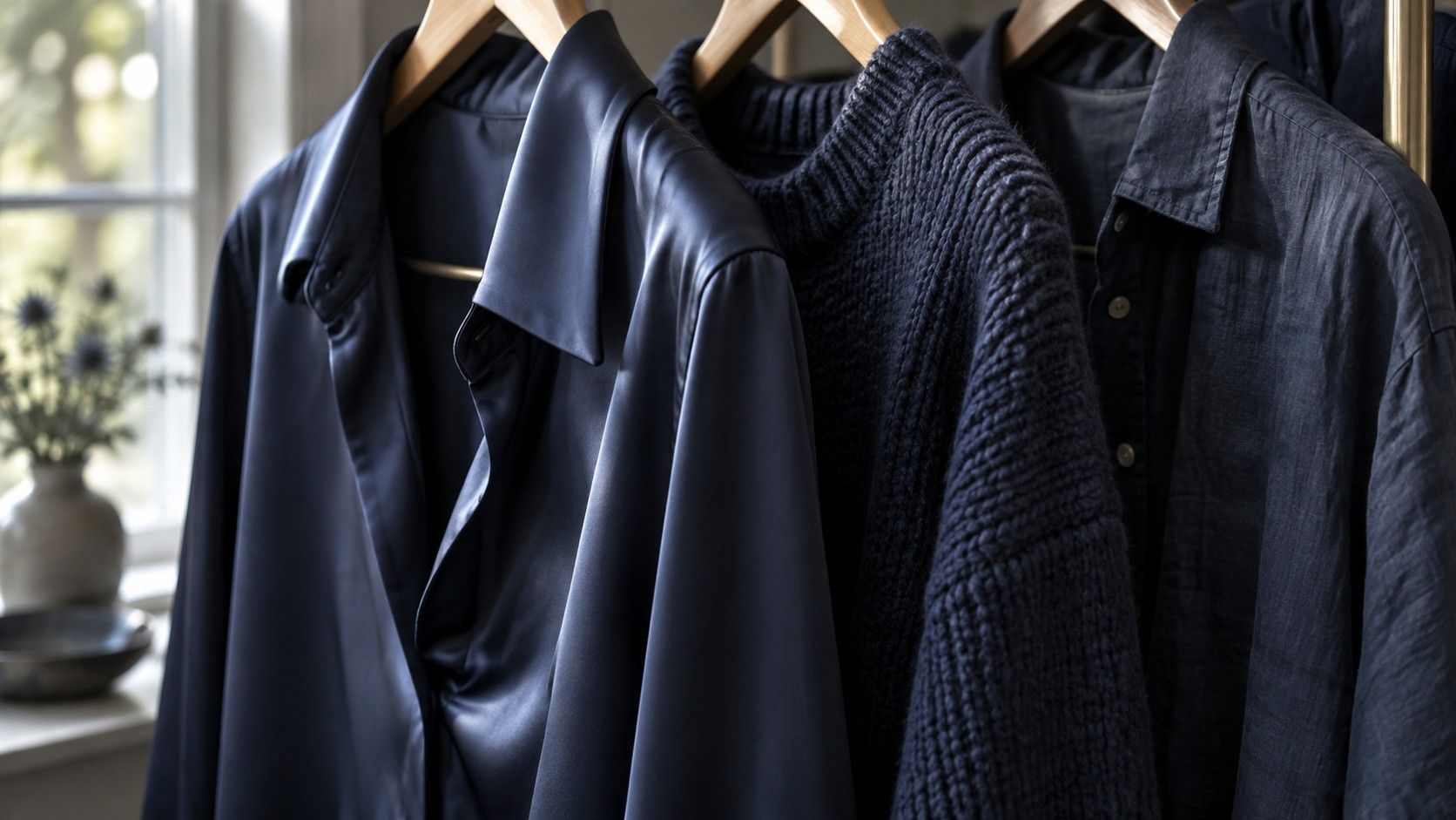
A navy satin blouse and a navy wool sweater can look like different colors even when their labels use the same name. The satin catches pale highlights; the knit contains tiny shadows. If one works beside your face and the other feels distracting, your seasonal palette has not necessarily changed. The useful question is what the fabric does to that color under the light in which you will wear it.
Compare color and finish separately
A seasonal color palette analysis usually considers hue, value and chroma: the color family and its warm or cool tendency, how light or dark it looks, and how clear or muted it appears. Real clothes add another variable. Surface texture, thickness, weave and shine affect the light reaching your eye, so the experience of a color depends partly on the material carrying it.
Start with two garments that are close in hue and depth. Comparing a pale blue linen shirt with a black satin top tells you little about finish because almost everything changes at once. A matte navy cotton shirt and a similar navy satin blouse make a more useful pair. Hold each at the same height below your chin in indirect window light, keeping your position and background steady.
Look at the garment first. Does its brightest patch become almost white? Does a folded area become nearly black? Then look at the face as a whole. You are judging an outfit preference, not measuring a biological response. Describe what you can actually see: a shiny shoulder attracts attention, the neckline looks sharper, or the quieter fabric makes the face easier to notice.
Keep the result specific to the sample. One soft navy sweater does not establish that all knitwear belongs to Summer, and a luminous satin does not turn every shade into a Winter color. A clear coral can be knitted; a muted mauve can be glossy. Color and surface interact, but neither cancels the other.
Watch highlights on satin
Satin describes a weave rather than one particular fiber. Its smooth face can produce bright directional reflections. Turn a sleeve or shoulder slightly and the apparent depth may change. That movement explains why a flat online image can make an evening blouse look more even and restrained than it does at a dinner table.
For a practical test, drape the fabric naturally instead of stretching it into a perfectly flat rectangle. Make one fold near the neckline and watch both the highlight and the shadow. A dark plum might show a pale lavender flash; a bronze might become markedly golden where it catches light. Those visible shifts matter more than the marketing name on the tag.
Try the garment under the room lighting you expect to use. A cool blue in daylight may look different beneath a warm lamp, and the shine can emphasize that change. This does not require recreating an entire venue. A second check in your ordinary evening room can reveal whether the outfit still has the balance you liked by the window.
If the reflection feels too prominent, reduce the shiny area near the face. Wear the blouse beneath a matte jacket, choose a lower neckline with a quiet layer, or keep the sheen in a skirt. You may enjoy the color and the finish separately while preferring less of their combined effect around the collar.
Keep knitwear texture from flattening contrast
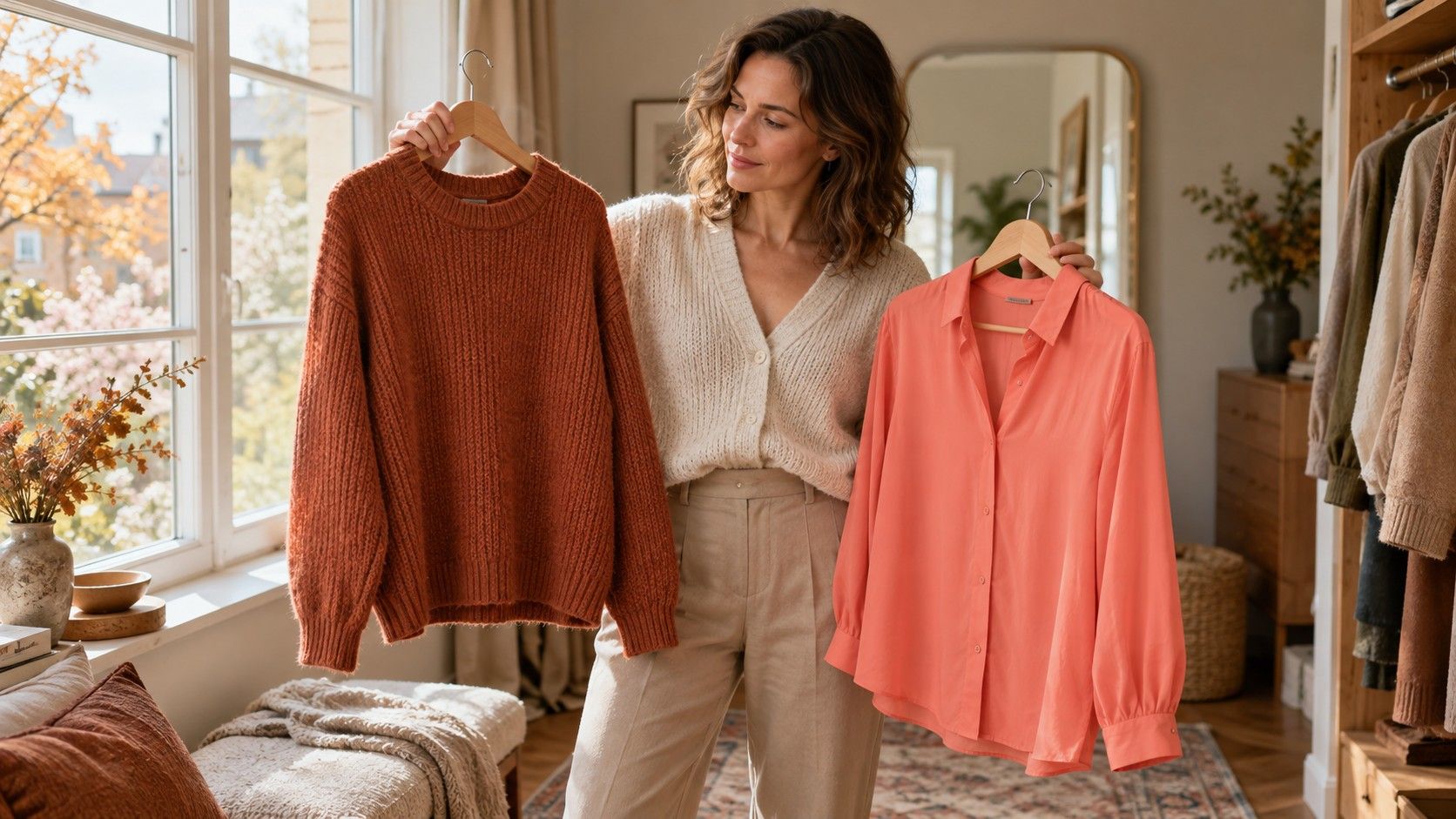
A knit surface contains loops, shadows and sometimes a visible halo of fibers. A brushed pale gray can look less crisp than a smooth gray jersey, even if both sit in a similar color range. Marl yarn introduces another complication: several thread colors mix at normal viewing distance, while close up you can still see each one.
Check a knit at the distance another person would normally see you. A photograph taken inches from the sleeve may exaggerate individual threads and hide the overall effect. Stand back from the mirror, then compare the face, neckline and top half of the outfit together. If the sweater looks flat, the cause may be an entire outfit at one lightness rather than the sweater's undertone.
Add definition in a controlled way. A muted blue sweater can sit over a slightly lighter shirt collar; a taupe cardigan can frame a deeper top. Both changes introduce a boundary without requiring a vivid accent. For someone who prefers stronger contrast, a smooth dark neckline under a textured jacket may work better than piling several fuzzy surfaces together.
Examine pilling and wear as well. A new knit photographed under studio light may be smoother than the one in your wardrobe. Surface fuzz can scatter light and soften the apparent color. That is a garment condition issue, not evidence that your personal palette needs a new seasonal name.
Check sheer linen with its underlayer
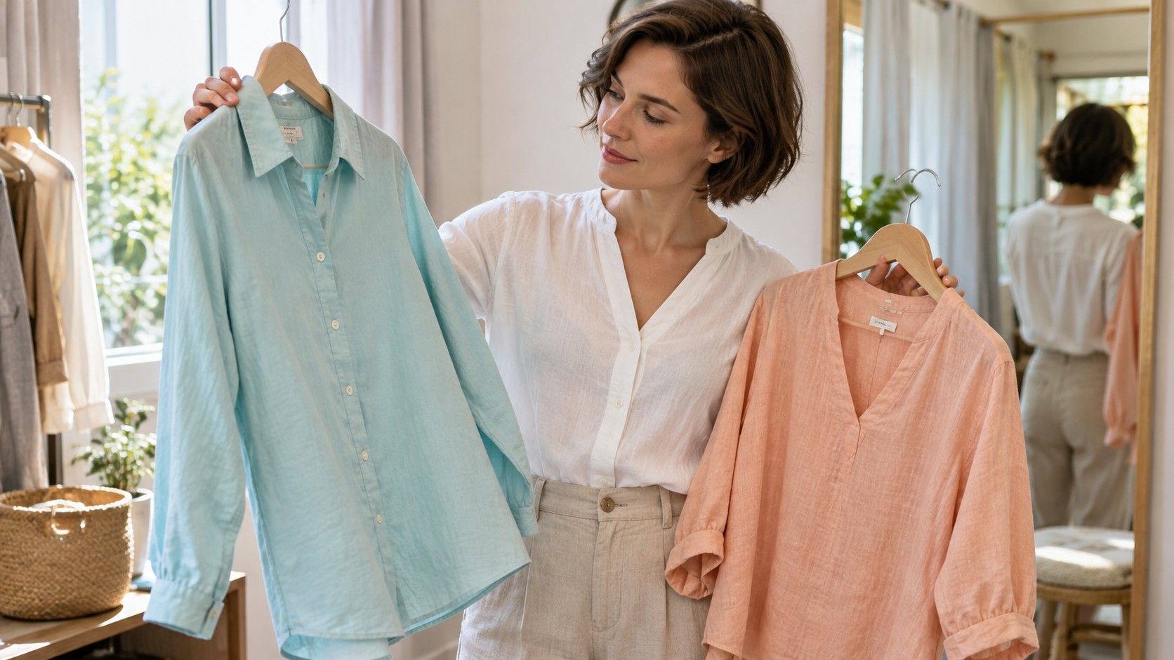
Light linen can be partly translucent, especially in pale colors or an open weave. The color you see on the hanger may change when the garment sits over skin, a white camisole or a dark undershirt. A pale blue shirt backed by bright white can look cleaner and lighter than the same shirt over a beige layer.
Test linen with the layer you will actually wear. Place it over the camisole before deciding whether the color is too warm, too cool or too dull. Check the doubled fabric at a pocket or seam beside the single layer: differences in opacity may explain patches of apparent saturation. Do not try to solve a transparency problem by choosing a different season.
Wrinkles also create shadows. A pressed sample may look smooth and pale, while a worn shirt acquires deeper folds around the elbows and waist. Some people enjoy that relaxed variation. Others prefer a denser weave when they want a more even block of color. Both choices can fit the same general palette.
For trousers and skirts, assess the whole outfit rather than holding a scrap under your chin. A warm-looking linen trouser can be easy to wear with a cooler top because the fabric is farther from the face. The relationship between garments, the amount of each color and your intended style all matter.
Use a fabric comparison before an expensive purchase
Before buying a statement coat or occasion outfit, compare the actual material with one reliable garment you own. A phone palette is a useful reminder of a color family, but the screen emits light and cannot reproduce every property of fabric. Bring a small familiar scarf or wear a top whose color you understand, then compare both pieces under the same lighting.
Make three short notes: the color in quiet daylight, the brightest highlight, and the deepest fold. For example, a jacket may read as blue gray overall, silver on its shoulder and charcoal inside the lapel. That description is more useful for choosing shoes and a shirt than insisting the jacket must match one digital square exactly.
Photograph the outfit only as a secondary record. Keep exposure and framing similar, avoid filters and check that the phone has not changed the white balance between shots. If the screen image contradicts what you consistently see in person, do another in-person comparison before treating the photograph as decisive.
Keep a purchase when the complete garment works for the intended setting, feels comfortable and combines with clothes you already use. Return it when you would need several extra purchases or constant adjustments to enjoy wearing it. A seasonal palette can narrow the search; the final decision belongs to the real fabric, the real outfit and your own preference.