An olive cast can make a seasonal color result harder to interpret, especially when a foundation looks orange and a quiz calls you warm. That experience does not establish whether Deep Winter is the right clothing palette. A more useful starting point is a controlled comparison: do deep colors work well near your face, and do you prefer those colors cooler, warmer, clearer or softer?
Separate olive appearance from a season verdict
Olive is used in everyday beauty language to describe a greenish or gray-green impression in skin. People use the term in different ways, and a photograph alone is an uncertain basis for assigning an undertone. Olive-looking skin is found across a range of depths. It does not automatically mean warm, cool, light, deep or one particular season.
Deep Winter is generally used for a palette where depth matters and colors lean cool, often with some clarity. Different seasonal systems draw the boundaries differently. If a result gives you that name, ask what the palette actually contains before using it to make purchases. Two charts carrying the same label may differ in softness, temperature and contrast.
Separate three observations in your notes: the appearance of your skin, your preference between fabric colors, and the makeup shades that match you. They can inform one another, but they do different jobs. A foundation mismatch does not prove that a navy shirt is wrong; enjoying a navy shirt does not tell you which foundation formula to buy.
Use the term olive as context for a comparison rather than a shortcut around it. You do not need to decide on a precise skin classification before testing a plum knit against a rust one. The practical aim is to find clothes you enjoy wearing, not to make every piece of beauty vocabulary agree.
Compare deep cool and warm colors equally
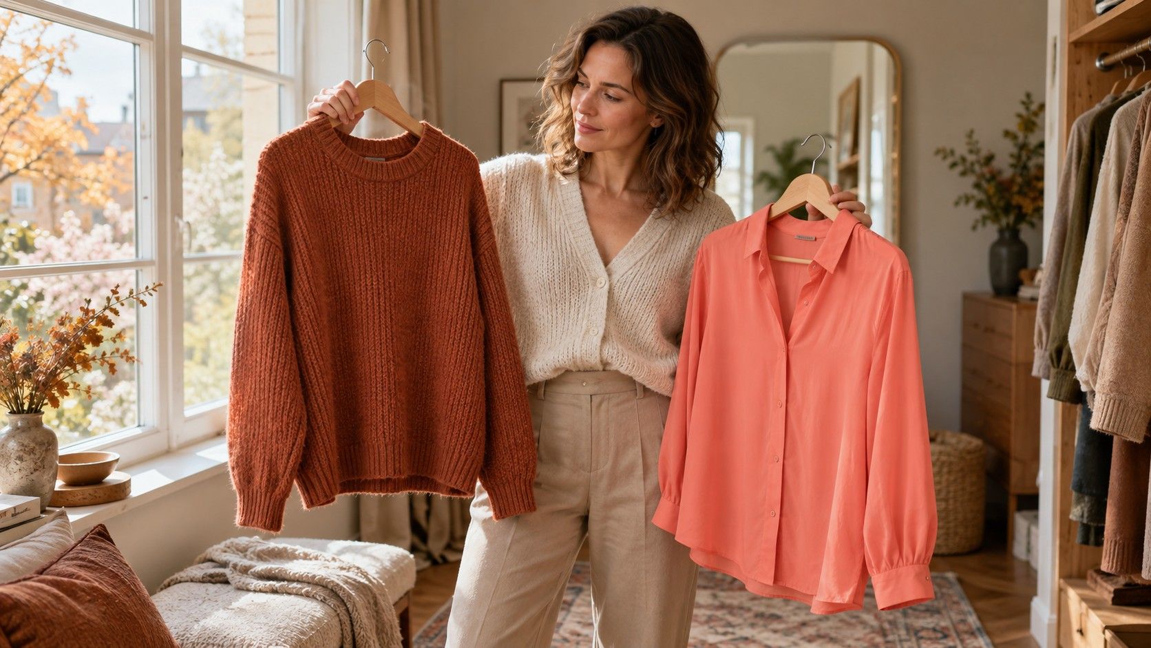
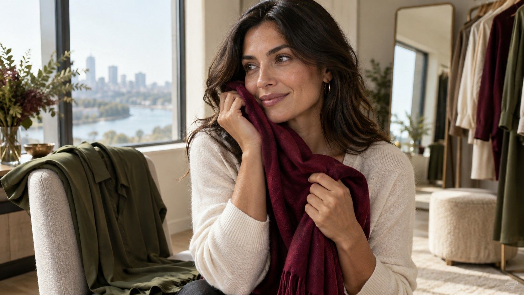
Choose two fabrics with broadly similar depth and finish. Deep burgundy leaning toward berry and a warm dark rust can be a useful starting pair. So can a cool dark green and a warmer olive green, provided one is not dramatically lighter or shinier than the other. These are sample comparisons, not fixed diagnostic tests.
Stand near a window with indirect daylight. Avoid direct sunshine, which can create bright highlights and hard shadows, and turn off strongly colored lamps during the first comparison. Hold each fabric over your usual top at the same height below your chin. Keep your position steady and swap fabrics rather than changing rooms or moving between mirrors.
Look for an overall relationship you can describe without borrowing a seasonal verdict. One fabric may make the face feel more separate from the clothing; another may blend more gently. A reflection under the chin may change. You might prefer the stronger framing of the cool color, or you might find the warm one easier to wear. Record the observation before naming a season.
Repeat with another pair. A single rusty scarf might be too bright, too shiny or simply a color you dislike. If several deep cool samples consistently work better than comparable warm ones, that gives you a stronger reason to explore a Deep Winter palette. It still does not require every warm item in your wardrobe to disappear.
Use softer and clearer fabric as a second test
Once you have a preference about depth and temperature, compare saturation. A muted plum and a clearer berry can occupy a similar depth while producing different effects. A smoky navy and a cleaner blue navy offer another pair. Keep the color family reasonably close so that a dramatic change in hue does not dominate the test.
If the softer option feels quiet and balanced while the clearer one takes over, note that result. You may prefer a muted cool wardrobe, or you may simply need less of the bright color near the face. If the clear option brings welcome definition and the smoky one feels flat, a clearer deep palette may be useful. Neither reaction can be read reliably from skin depth alone.
Try a small accent before judging an entire palette. A clear berry scarf on a dark top can be pleasing even when a full berry blouse feels too much. The amount of color and the shape of the neckline influence the outfit. Seasonal charts show isolated samples, while clothes place those samples in different proportions.
Keep a neutral in the comparison. Black, charcoal and dark navy are not interchangeable. Black may create a sharp boundary, charcoal a softer one, and navy a more visibly colored frame. Test each beside the same face and hair rather than assuming the darkest sample must win because the palette name includes deep.
Check makeup and reflections as confounders
A tinted base, bronzer or strongly colored lipstick can shift the overall impression of a fabric test. If your goal is to compare clothing against your natural coloring, start with minimal color cosmetics. Later repeat the comparison with the makeup you normally wear. Both views matter, but they answer slightly different questions.
Do not use skin redness as a simple warm-or-cool verdict. Temporary flushing, uneven surface color and the light in the room can affect what you see. A bright green curtain, warm wooden wall or vivid top can also reflect color toward the face. Move away from obvious colored surfaces before treating a greenish or yellowish cast as part of the skin itself.
Phone cameras introduce their own changes. Automatic white balance may alter between a dark scarf and a light one; exposure may brighten the face when more dark fabric enters the frame. Keep the framing similar, avoid beauty filters and use photographs as supporting records. A screen is especially poor evidence when the camera has made different adjustments for each shot.
If a foundation seems orange, assess that product separately in ordinary daylight and according to how you wear it. A shade may be too deep, too saturated or too warm, and a formula may look different after application. That is useful makeup information, but it cannot by itself distinguish Deep Winter from Deep Autumn or a muted cool palette.
Build a provisional deep wardrobe
You can use a deep winter olive skin color palette as a search phrase while keeping the resulting suggestions provisional. Start with one tested dark neutral, one lighter contrast color and one accent. A navy top, a soft cool-looking white layer and a berry accessory might be a workable example; your actual samples should decide.
Build two complete outfits before buying more. Pair the same top with trousers you already own, then try it beneath a familiar jacket. If the outfit works only with a new lipstick, new shoes and a different coat, the top may be less useful than it seemed during the fabric comparison. Practical coordination is part of the decision.
Keep warm favorites where you enjoy them. A tan bag or warm brown boot is farther from the face than a high-necked sweater. A warm print can be balanced by a cooler background or by the color at its neckline. You can adapt the proportions without claiming that an entire color family is forbidden.
Revisit the working palette after several ordinary wears. Save short notes about the specific colors and combinations you reach for, including any exceptions. If the border between Deep Winter and another deep palette remains uncertain, keep the shared successful shades and test the disputed ones slowly. A useful wardrobe does not depend on settling every label first.